There’s a tendency among homeowners to play it safe with paint — hugging the whites and beiges, afraid that anything more daring will look “too much.” But the most memorable, characterful homes are rarely the cautious ones. With the right styling, bold and unconventional colours can transform a space from pleasant to genuinely unforgettable.
Interestingly, Pantone’s Colour of the Year 2026 — Cloud Dancer, a serene, lofty white — signals a cultural shift towards calm, clarity, and simplification. But that doesn’t mean bold colour is out. If anything, a clean white backdrop makes a statement accent colour pop even more dramatically. Use Cloud Dancer as your base, and one of these unconventional shades as your pièce de résistance.
Here are six Nippon Paint colours that are anything but ordinary — and how to use each one brilliantly.
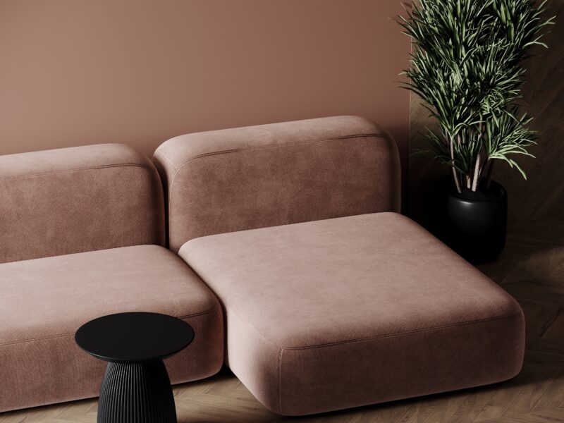
Greek Legend (NP AC 2113 A)
Source: Unsplash
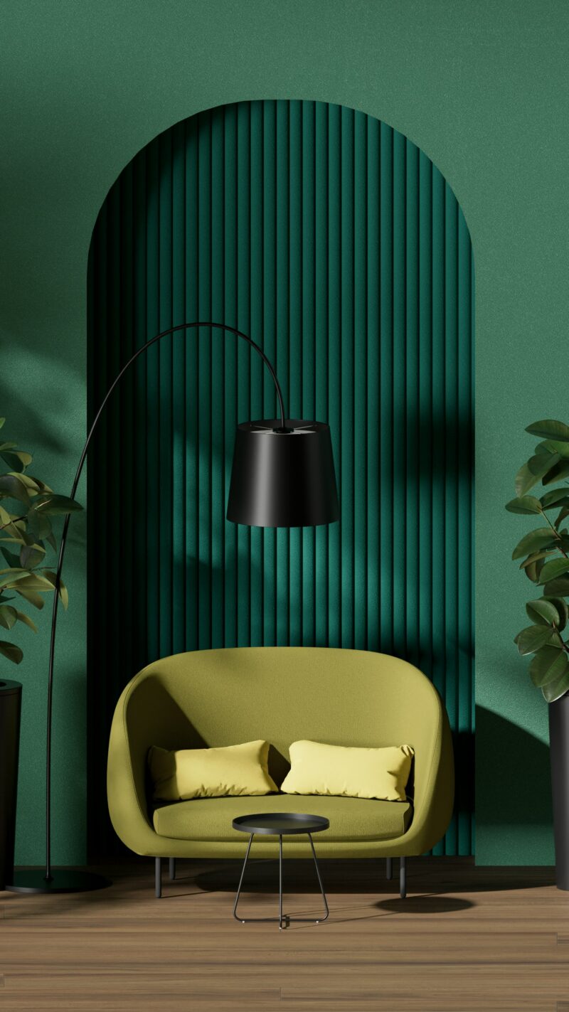
Deep, saturated, and undeniably bold, Greek Legend is a rich botanical green that commands immediate attention. In 2026, deep greens like this sit at the intersection of two dominant trends: biophilic design (bringing nature indoors) and jewel-toned maximalism. The result is a colour that feels simultaneously timeless and of-the-moment.
Try painting a single feature wall in your living room in Greek Legend and let it do the talking. Beige-brown sofas and natural wood furniture tone down the overall look beautifully, while green accessories — plants, cushions, ceramic vases — reinforce the lush, botanical quality of the wall. Fresh flowers, of course, are a perfect finishing touch.
Lemon Yellow (NP YO 1090P)
Source: Freepik
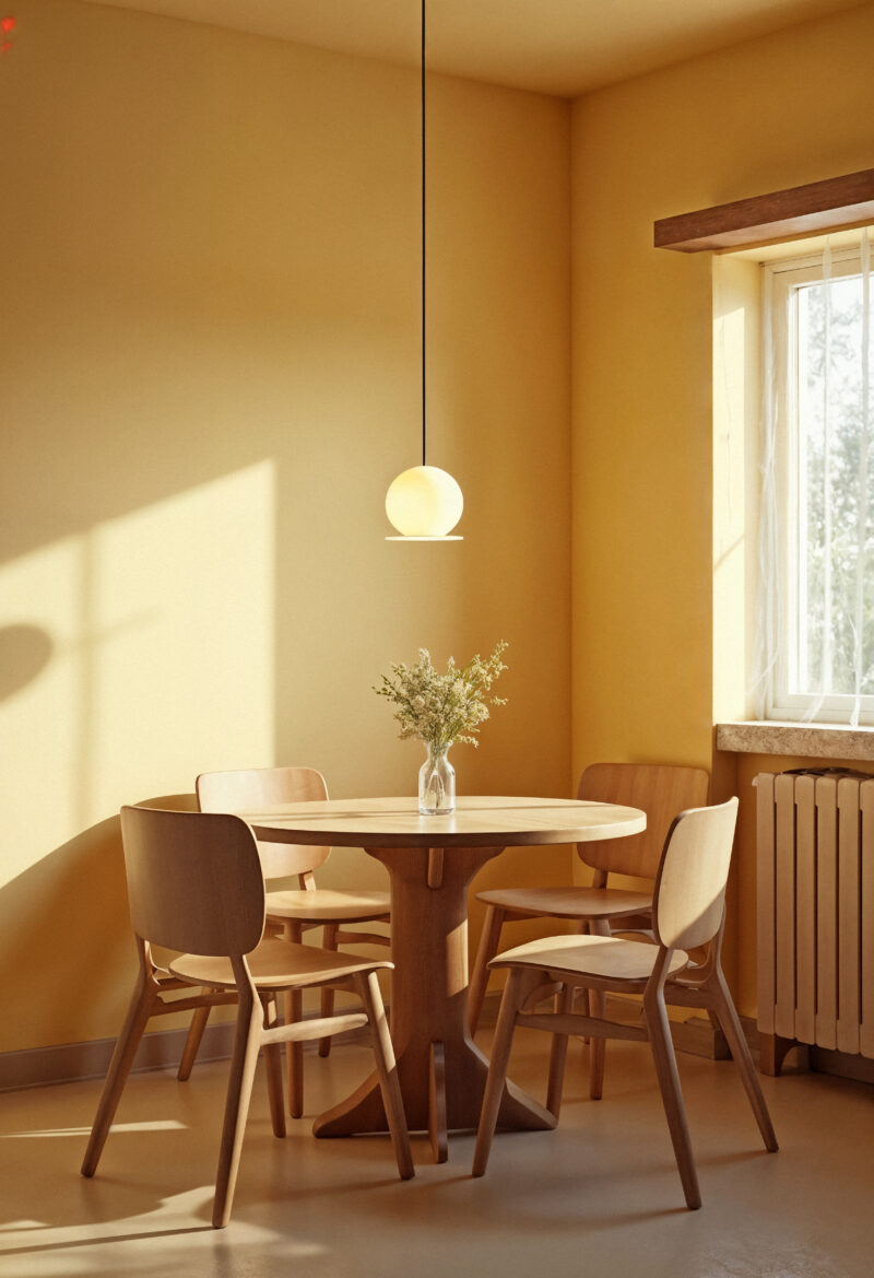
Yellow has an undeserved reputation for being difficult — people assume it’ll look harsh or overpowering. Lemon Yellow proves otherwise. Its clean, pleasant tone lifts the mood of any room almost instantly, bringing a burst of warmth and optimism that few other colours can match.
The key to making yellow work is in what you pair it with. Blue and white furniture complement a bright yellow wall beautifully, creating a fresh, summery contrast. Keep the furniture modern and minimalist in silhouette to prevent the room from feeling dated — this is a colour that rewards clean lines and considered styling.
Alpine Pink (NP R 1289D)
Source: Vecteezy
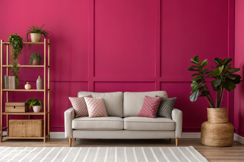
Hot pink in the home used to feel niche. In 2026, it’s mainstream — and with good reason. Pink has crossed firmly into the territory of adult interiors, embraced by designers globally as a confident, joyful choice that brings genuine warmth and character to a space.
Alpine Pink is a particularly good entry point for the colour. Rather than painting an entire room, try it in the entryway — your guests’ first impression of your home will be one of striking, cheerful confidence. Pair with bold, retro decorative pieces that match the colour’s energy: geometric shapes, brass accents, and statement lighting all work well here.
Puritan Black (NP N 1982D)
Source: Shutterstock
Deep greys and charcoals have become a staple of contemporary interior design — and Puritan Black sits in exactly the right territory. It’s not a stark black, but a rich, dark grey that brings quiet sophistication and edge to any space.
If the idea of a fully dark room feels too much, start with a single feature wall. The deep grey creates contrast against white or light walls, adding visual weight and drama to the focal point of the room. For those ready to commit more fully, Puritan Black works beautifully across larger areas when balanced with minimalist furniture, exposed concrete accents, and industrial-inspired lighting.
Pitter Patter (NP N 1933D)
Source: Shutterstock
Dark brown is having a moment in 2026. Long underestimated as a wall colour, rich earthy browns are being embraced as a sophisticated alternative to grey — warmer, cosier, and deeply grounding.
Pitter Patter’s deep, earthy tone makes a room feel genuinely snug — like being wrapped in something warm and familiar. Black or white furniture pieces pair well with this earthy shade, offering clean contrast that prevents the room from feeling too heavy. For a contemporary Japandi-inspired take, add light natural wood pieces and keep the overall look deliberately uncluttered. Rooms with good natural light are particularly well-suited to this colour, as the sunlight brings out the warmth in the brown and prevents the space from feeling dim.
Blue Entry (NP BGG 1574T)
Source: Shutterstock
Blue Entry is the kind of blue that makes a room feel like a mini-holiday — its blue-green quality is reminiscent of beach waves and tropical waters, bringing a refreshing, resort-like energy into everyday spaces.
It’s a versatile shade that works across multiple rooms. In a living room, pair it with light wood furniture and a grey or cream sofa for a relaxed, coastal look. Add beach-themed decorative pieces if you want to lean into the resort aesthetic, or keep accessories minimal for something more contemporary and sophisticated. Either way, the colour does most of the heavy lifting.
Ready to find your perfect unconventional shade? Explore Nippon Paint’s full range of over 2,300 colours at nipponpaint.com.sg/colours/find-your-colour/.
House Painting Essentials - Rules You Should Never Break