Neutral colour palettes have a lot to offer in the world of interior design. These are your blacks, whites, browns, greys and everything in between. They’re muted tones that are often regarded as ‘colourless’ and are incredibly versatile to work with. They’re also known to have a calming effect on the psyche.
Whether you want to keep things mellow or pack a punch, a neutral palette can do it for you – with the right styling of course!
In this article, we explore exquisite palettes inspired by our colour paint chart. Discover pairings that’ll soothe and delight like brown and beige, and chic, timeless ones like black and white. Pick up expert tips such as creating depth and controlling a room’s focal point with these muted colour schemes.
Dive into the wonderful world of neutrals and their benefits with these 8 gorgeously styled neutral colour palettes!
Best Neutral Colour Palettes for Your Home’s Interior Design
From warm and inviting palettes to grounded and sophisticated ones, there’s a wide range of possibilities a neutral colour scheme can offer!
1. Warm neutral colour palette
A touch of warm undertones in your neutral colour palette can make a room feel more comfortable, familial and, well, warm. These are your whites, greys and browns that have a tinge of yellow, orange or red to them
Mix and match colours like greige and yellowish-brown with a solid white on your walls, furniture and accents. The palette brings a wholesome, natural feel into the home due to the abundance of browns.
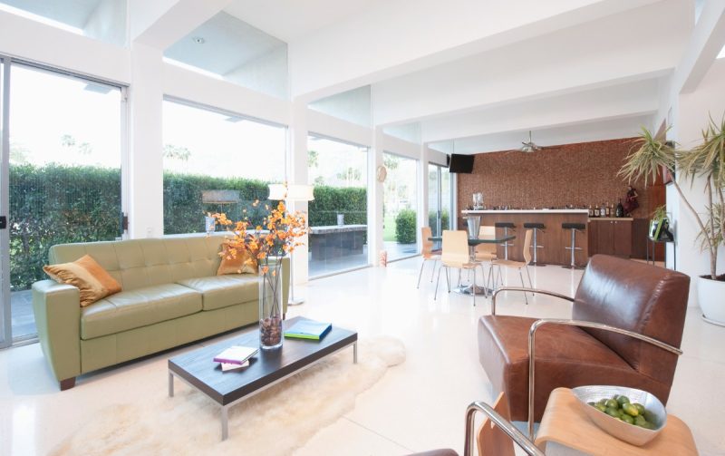
2. Brown and beige colour palette
A classic neutral colour combination in fashion and interior design, beige and brown can bring a sense of calm and groundedness into a home. Introduce a light beige theme to a room to set up an airy, relaxing feel. Then add darker brown accent colours to represent resilience and stability.
Create a little sanctuary away from the hustle and bustle of life by decking your walls (and halls) in brown and beige hues!
3. Dark earth tone palette
A dark, earthy theme can add some depth to your neutral palette. Many people find earthy tones calming, bringing in all the nurturing goodness of nature.
Here, the colour you’ll be working with most is a rich dark brown that can add sophistication and warmth to your space. The easiest way to incorporate this is by furnishing your room with deep coloured wooden furniture like a table or tv console.
Keep your interiors feeling open and airy by working with a lighter base colour like warm-undertone whites on your walls, cushions and other furniture. Then, tie in the look with some muted browns.
4. Monochromatic colour palette
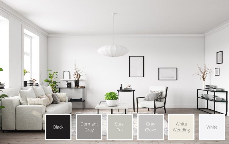
Opt for a clean, minimalistic look with timeless monochrome. Going for a primarily white palette can open up your room and bring a sense of serenity to it. Inject some visual allure with stark black lines in your furniture and frames. Pepper in some grey pieces to bring it all together.
The colour scheme also does wonders when it comes to bringing in accent pieces. Add something as simple as a houseplant to add a delightful pop of colour to the space!
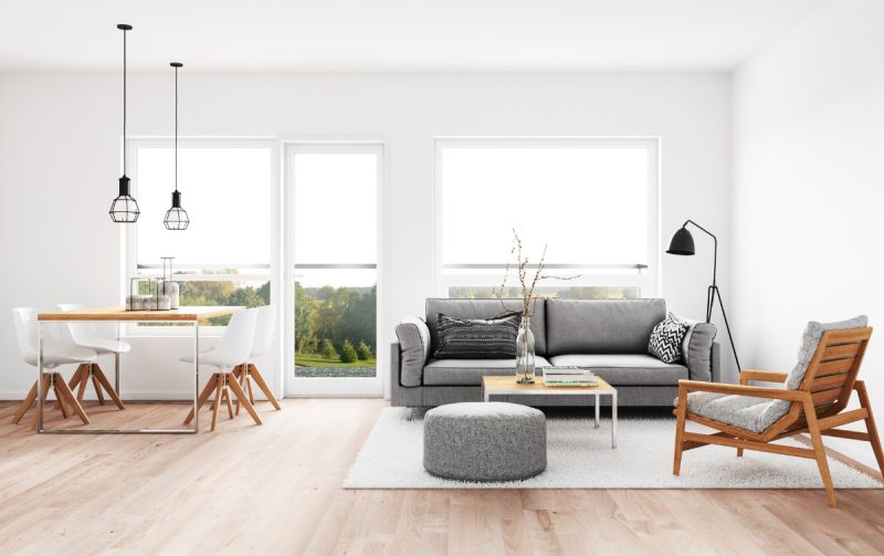
5. Grey colour palette with warm hues
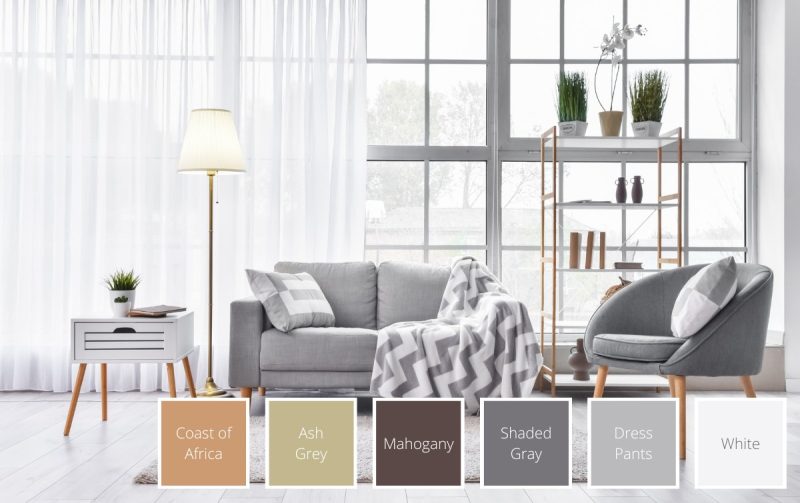
Grey makes for a versatile choice when deciding on a room’s colour scheme. It can be styled as modern, edgy, elegant or serious depending on the hues and pieces you choose. The best part about this neutral is that you get to inject different moods into the palette with different accent colours.
Create a cosy and timeless vibe with warm-hued brown furniture trimmings against a primarily grey palette. The look can be so calming and inviting you may just never want to leave your room – you’ve been warned.
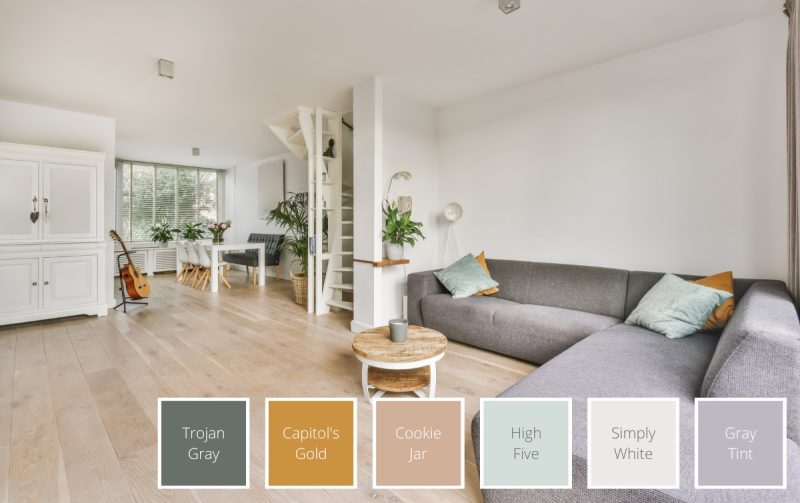
6. Blue-grey and brass palette
For the dreamers and the young at heart, a blue-grey and brass palette can create a comforting, cloudlike feel in a living room. They add a tinge of pink and blue to a neutral colour scheme; combined with other light colours, it can emulate the dreamlike wonder of childhood.
Recreate this look by dressing your room with a white sofa, blue-grey pillows and decorations, along with sleek brass lamps and coffee tables!
7. Ivory with warm neutrals colour palette
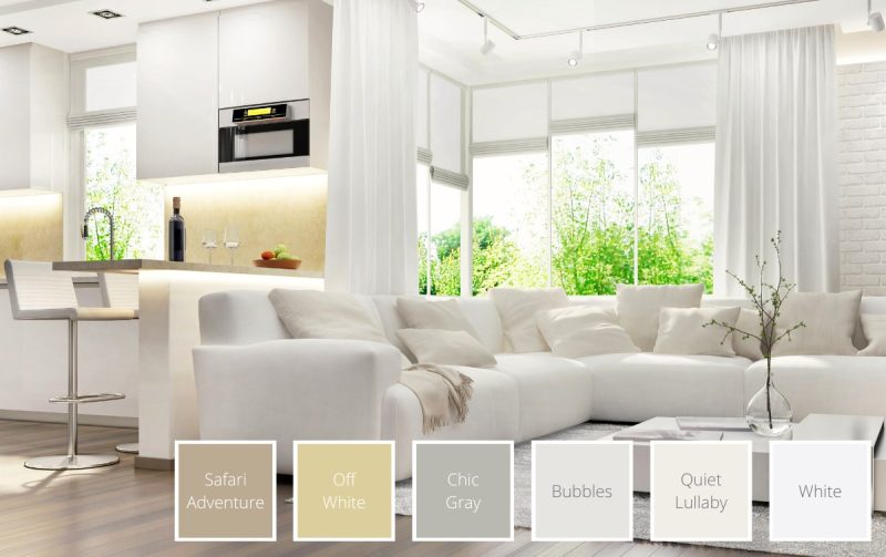
The colour ivory has historically been associated with luxury. Bringing it into a home’s colour palette can make the place feel incredibly chic and posh. At the same time, it also adds warmth to a space due to its yellow undertones.
Pair this lovely colour with warm shades of brown, grey and beige to max out on class and comfort. For a pop of colour, go for a more saturated warm neutral feature wall. A houseplant’s touch of green can make the space look more dynamic too!
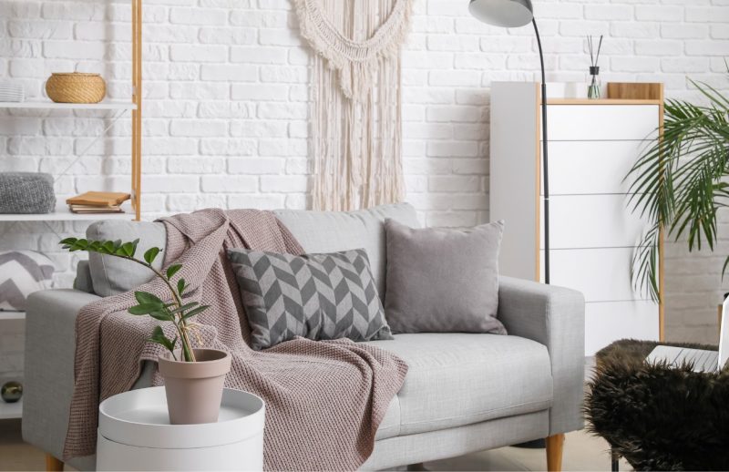
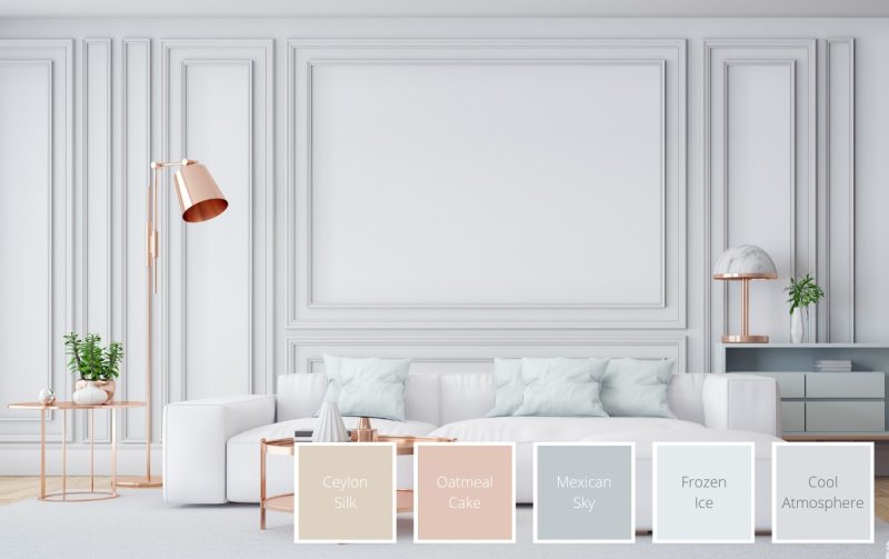
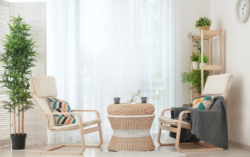
8. Pastel neutral tones with metallic colours
For a soft, romantic look that doesn’t skimp on visual interest, try a pastel neutral palette with metallic colours!
Pastel neutrals give a light and rejuvenating earthy feel to a space. On the other hand, metallic blue-green or gold-brown accents bring a little glamour to the table that’s simply irresistible.
Light-coloured wooden parquet floorings work beautifully with white walls and furniture. Add some depth with a classy pastel grey couch and sprinkle in some wooden accents. You can go light with the metallics – simple throw pillows can do the trick. It can bring a gorgeous shine to your room that may even make it look larger.
Benefits of Using a Neutral Colour Palette in the Home
Neutral colour palettes work well both visually and practically as they are versatile and can create a balanced and relaxing look for the home!
Creates balance
Neutral colours create balance in a design, setting up a clean canvas for you to fill with other bold features and colours. They create visual breaks in a space, preventing an aesthetic from being too overstimulating.
A neutral colour palette allows you to take control of a space, directing attention to any special decorations or areas. It’s also easy to create accents and depth without making the space feel cluttered.
Creates a sense of relaxation
Neutral tones are known to have a calming effect on the mind. These muted hues represent a sense of stillness that can create a relaxing environment after a day of sensory stimulation. Colours like beige and cream also bring a rejuvenating, natural look to a space (think wood, sand and soil).
Versatile
The colour palette is known to pair well with almost all colours, from bright greens to deep purples. It can often tie different colours together, creating a cohesive look for anything you’re styling.
These colours can also be incorporated into a wide range of interior design styles. Want a chic, modern Japanese aesthetic to spruce up your home? How about something industrial or eclectic for your HDB renovation design? A neutral palette is a great place to start.
Tips for Creating a Neutral Colour Scheme at Home
Here are some tips to help you make the most of this gorgeous colour scheme while designing your spaces!
Pair light and dark neutral colours
When we talk about neutrals, what comes to mind is often a lighter variation, like tan, beige or white. However, incorporating dark neutrals like dark brown, deep gold and charcoal grey can open up a whole range of possibilities for interior design.
Dark neutrals are great at giving visual weight, especially when exploring two colour combinations for your bedroom or living room. Start with darker coloured furnishings like an armchair or coffee table, or an accent wall. Then, complete the rest of the palette with lighter walls, ceilings and floorings.
Consider the lighting in the room
The colours you choose for your room may look different under different types of lighting. Your house may get a different quality of natural light compared to another person’s. Natural light also changes as the day progresses.
Before painting a room, it’s good to test how the colour will look with the light you get in the space. Get samples of painted drywall and test them out at different timings and areas in your room to cover all bases.
You’ll want to consider your lighting fixtures as well. For example, warm-hued lighting mutes cool colours like green and blue, and makes warm colours more vivid.
Mix neutral with bright colours
We’ve talked about the balance a neutral palette gives to a room. This is a central principle that makes neutrals pair so well with bright colours. If you’d like to make a gorgeous vivid colour pop, a neutral base is the way to go.
The muted quality of neutrals draw the eye to accents and pops of colour. They also offer a certain amount of breathing space, letting your design shine without being too overpowering.
FAQs About Neutral Colour Palettes
What are the types of neutral colours?
The different types of neutral colours include:
- Pure neutrals
These are fully saturated neutrals that don’t have an undertone. The 4 most common ones include black, white, grey and brown.
- Near neutrals
Created by mixing pure neutrals with primary colours, near neutrals have lower saturations than pure ones. For example, mixing yellow and white creates the near neutral, ivory.
- Warm and cool neutrals
Warm neutrals (e.g. beige, gold) are made by mixing a pure or near neutral with warm colours like orange, yellow or red. On the other hand, cool neutrals (e.g. blue-grey, taupe) have undertones of blue, green or purple
What neutral colours go together?
Generally, all neutrals go well together! This is especially true for colours with similar undertones (e.g. warm-undertone neutrals work well together).
More specifically, some great neutral colour pairings include:
- Beige and brown
- Dark brown and white
- Black and white
- Grey and tan
- Ivory and beige
8 Fun Ways to Create a Geometric Wall Paint Design with a Step-by-step Guide for Beginners