If you’re thinking of giving your space an update but don’t want to invest in new furniture you don’t need, a splash of some fresh colour on those walls might be just what you need.
Step out of your comfort zone and away from boring all-white walls and ceilings. Instead, draw some new colour inspiration from the big screen. Check out these five colour schemes we picked out from Nippon Paint, inspired by a few famous films.
1. The Grand Budapest Hotel
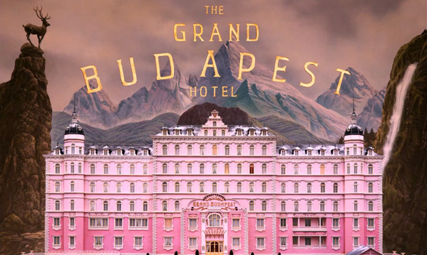
“The Grand Budapest Hotel”, produced by American Empirical Pictures et al.
The 2014 comedy is a great one to start with. Director Wes Anderson is known for his use of specific colour palettes in his movies. Coupled with his symmetrical style and unique composition, Anderson’s creations are rather reminiscent of storybooks and fairytales.
The Grand Budapest Hotel is a humorous, light-hearted tale set in the 1930s and revolves around a group of eccentric characters that live and work in the hotel. Most scenes are in light, slightly washed out shades of pinks and purples–perfect for a bedroom or living room. Pick some neutrals like New Brick to balance out the pretty pastels like Rosy Cushion and Pretty Box.

2. The Revenant
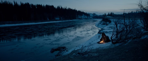
“The Revanant”, produced by Regency Enterprises et al.
As a story about a man’s struggle for survival and revenge, The Revenant has a dark and cold, yet tranquil and beautiful colour palette. Set in the snowy mountains of unorganised U.S territory, conditions were harsh, but the scenery was absolutely breathtaking.
Seemingly endless snow-capped peaks were lined with tall, green conifers under a huge expanse of cloudy skies. With these muted blues and greys such as the aptly named Alaskan Seas and Eastward, you’ll feel like you’re making the arduous journey with Leonardo DiCaprio–but from the comfort of your own room.
3. Moulin Rouge!
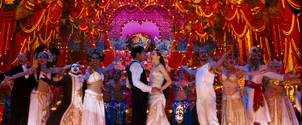
“Moulin Rouge!”, produced by Bazmark Productions and Angel Studios
When it comes to fun and excitement, nothing beats the rhythm of the night. Full of life, love and non-stop entertainment, Moulin Rouge! is a 2001 musical film about a young Scottish writer who falls in love with the star of the Moulin Rouge cabaret.
With popular songs like ‘Come What May’ becoming huge hits after the movie’s release, Moulin Rouge! hasbecome something of a modern-day classic.
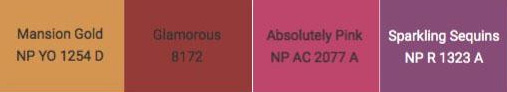
Bring the same rich, bold tones of Moulin Rouge! and the cabaret to your living space by livening it up with colours like Glamorous and Mansion Gold. Accompanied with the right lush furniture, your guests will feel like they’ve walked into a cabaret in Paris. Now all that’s left is to draw the curtains and the stage is yours.
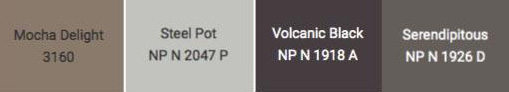
4. Star Wars: The Force Awakens

“Star Wars: The Force Awakens”, produced by Lucasfilm Ltd. and Bad Robot Productions
In the latest edition of pop culture’s greatest film franchise of all time, the setting was not just a great expanse of space as one might imagine. In fact, many of the biggest and most memorable scenes took place in the sandy, dusty planet of Tattoine.
Star Wars: The Force Awakens brings to mind a palette of beigey-nudes and sandy-browns. In tribute to this side of the force, try out cool neutral tones like Mocha Delight and Serendipitous anchored with Volcanic Black in a kitchen or bathroom space for an earthy yet sophisticated look.
5. Finding Dory
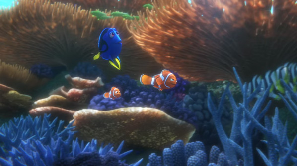
“Finding Dory”, produced by Walt Disney Pictures and Pixar Animation Studios
Last but not least, a colour palette inspired by one of the most highly-anticipated film sequels of all time–Finding Dory. 13 long years after Finding Nemo, our favourite fish friends embark on a new mission–to find Dory’s parents. Like all other Disney Pixar films, the animated movie isn’t just for kids. It has touched many adults too and once again reminds us that when life gets tough, just keep swimming.
Inspired by the deep blue sea, colours like Deepsea, Out At Sea and Electrify would look great with a pop of Harvest Flame in the little one’s bedroom or nursery, or even a study that needs some calming and relaxing vibes.

How To Prevent Wall Paint From Fading Out